
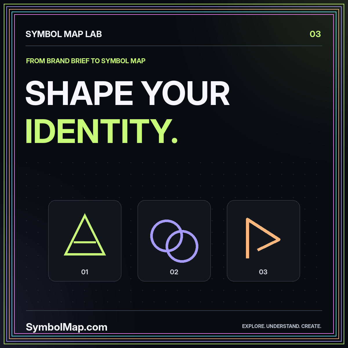
A logo symbol map is a structured way to explore visual directions before committing to a brand mark. Instead of placing dozens of appealing pictures on a mood board, you connect candidate forms to a specific brief, an intended impression, and a set of practical tests. The map makes design choices discussable without pretending that shapes have fixed psychological meanings.
Take a fictional neighbourhood repair workshop. Its brief might emphasize careful work, approachability, and continued use of existing objects. A circular form, a joined line, and a simplified tool silhouette are possible starting points. None automatically communicates the brief. The point of the map is to compare the choices and make the reasoning visible.
Translate adjectives into observable requirements
Brand workshops often begin with broad words such as trusted, modern, or human. Those words can be useful conversation starters, but they do not tell a designer how to draw a mark. Ask what a reader should notice or do. Should the workshop feel welcoming on a small sign? Should its symbol remain recognizable on a repair label?
Turn each answer into a requirement. A limited number of components, a clear silhouette, and space for a readable name are testable. “Looks premium” is less useful until the team agrees on what it means in this particular setting. Keep a short rationale next to every requirement so it does not become an arbitrary rule.
Also list exclusions. For the workshop, a complex gear illustration might imply industrial machinery rather than household repair. That is a hypothesis to test with the intended audience, not a universal rule about gears.
Create a small set of visual territories
A territory is a family of ideas, not a finished logo. One could explore continuity through a single unbroken path. Another could explore repair through two parts meeting. A third could use a letterform derived from the workshop's name. Give each territory a plain-language label and a short explanation.
Within a territory, vary construction rather than adding unrelated effects. Try an open version and an enclosed version; compare an angular join with a rounded one. This lets you see which change affects the design. A different gradient, shadow, and background on every sketch makes comparisons much harder.
Keep the number of territories manageable. Three carefully explained directions usually support a more focused discussion than a wall of unlabelled experiments. More options are useful only when they represent meaningful alternatives rather than cosmetic variations of the same idea.
Separate inspiration from copied construction
Build the map from your own sketches whenever possible. When recording a reference, identify what you are studying: spacing, balance, proportion, or reduction. Do not treat an existing brand's distinctive arrangement as a reusable template merely because it matches the brief.
A practical note might say: “Study the relationship between a compact symbol and a wide wordmark; do not reuse this silhouette.” The instruction points toward a design problem rather than toward imitation. Keep reference material separate from candidate assets so nobody exports the wrong image by mistake.
Cultural references deserve the same specificity. A motif can carry associations beyond the impression you intend. The religion symbol map offers a context-first research approach. An attractive form is not a substitute for understanding where a recognisable symbol is used and how its use may be received.
Compare silhouettes before presentation effects
Render each candidate as a single dark shape on a light background, then reverse it. This is a design exercise, not an assertion that all brands must use monochrome artwork. It isolates the structure so you can inspect gaps, balance, and unnecessary detail without being distracted by a polished mockup.
Show all candidates at the same size. A mark that dominates a page can feel more confident than one given a tiny corner, regardless of its quality. Equal presentation makes the comparison fairer and helps stakeholders comment on the actual construction.
Inspect the small version separately
Test the mark in the smallest real context in the brief, such as a browser tab or a narrow product label. Do not simply zoom out from a large presentation and assume the result is acceptable. Thin spaces can close, short strokes can disappear, and two components can merge into an unintended shape.
Give the wordmark its own review
A symbol map should not allow the icon to overshadow the name. Check spelling, spacing, line breaks, and how the name behaves beside the mark. Use actual text while exploring type rather than relying on lettering painted into a concept image. That keeps the words editable and easier to review.
Try horizontal and stacked arrangements, then identify which one is primary. Record a minimum clear-space rule in relation to the design itself rather than choosing a number that only works at one size. The goal is a handoff another person can follow without guessing what “leave enough room” means.
For a multilingual project, use the actual required language versions during the design review. A mockup containing only a short English name does not demonstrate that a longer translated name will fit. Treat those layouts as part of the core brief rather than a final adaptation.
Review function as well as appearance
A logo used as a home-page link is doing a job, not merely decorating the header. The W3C guidance on functional images explains that alternative text should communicate the function of an image used as a link or control. This gives the identity map a practical accessibility question: what will the surrounding interface tell a reader?
For example, a linked brand mark can be accompanied by a clear accessible name indicating the site's home page. A decorative repeat of the same mark may not need to announce itself again. Decide this from the actual context, not from one alternative-text string copied everywhere.
Include focus visibility and the size of the clickable area in a website handoff. These are interface requirements rather than features of the drawing, but an identity used online needs both to work well.
Make feedback specific enough to act on
Ask reviewers to connect comments to the brief. “The joined pieces are hard to distinguish at label size” identifies a problem you can test. “I do not like the blue” may still matter, but it should not replace a discussion about whether the mark fulfils its intended use.
Record disagreements without forcing an instant winner. One direction may read clearly on signage while another works better in a compact app tile. The map can show that tradeoff. A revision might combine useful construction principles, although mechanically mixing parts from every option often creates a less coherent result.
Do not invent a score that implies scientific precision. A simple status such as retain, revise, or set aside can be enough when accompanied by a reason. The reasoning is the durable part of the decision.
Prepare an identity handoff, not just a picture
The chosen direction needs editable source artwork, appropriate export files, color specifications, and examples of correct placement. Confirm that each file actually contains what its extension suggests. A vector container with a single embedded bitmap is different from an editable path-based drawing.
Keep a short design rationale in the package. Explain which elements are essential and which can change for a small-size variant. Include naming conventions so a colleague can distinguish the primary mark from a reversed version or an experimental draft.
For an assisted workflow, the AI logo maker guide and AI logo production article separate concept generation from file preparation and rights review. A convincing preview is one stage of the process, not its completion.
Conclusion: map choices before polishing them
A logo symbol map is valuable because it exposes assumptions early. It links visual ideas to a real brief, makes tradeoffs visible, and creates a record of why one direction moved forward. It does not prove that a circle means community or that a certain color guarantees trust.
Start with observable requirements, compare related constructions, and test the final direction in its actual uses. The result should be an identity that can be applied consistently, not simply an image that looked impressive in a presentation.
Explore this thread


