
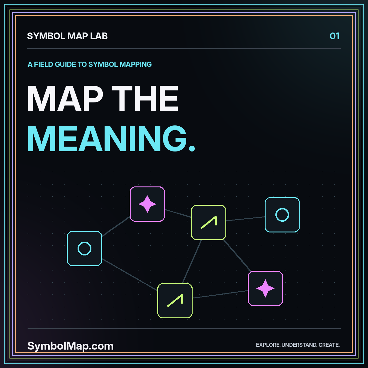
A symbol map is a way to organize signs so that their differences, relationships, and uses become easier to understand. It might connect interface icons by function, arrange geometric marks by shape, or document how a motif appears in a particular collection. The useful part is not the attractive arrangement. It is the explanation of what each connection means.
Start with a small question rather than an ambition to catalogue every symbol. A designer might ask which marks could represent movement in a navigation system. A researcher might compare named motifs in one documented collection. Those are different projects with different evidence requirements. This guide develops a practical method for either, without pretending that visual resemblance establishes a shared history.
Decide what the map is for
Write a one-sentence purpose before collecting images. For a fictional walking-guide project, the purpose could be: compare simple directional signs that remain distinguishable at small sizes. That sentence immediately excludes elaborate illustrations, decorative alphabets, and unrelated spiritual meanings. It also gives you a test for whether another entry belongs in the collection.
Choose the intended reader as carefully as the subject. A designer needs dimensions and construction notes. An editor needs naming conventions and source references. A visitor needs plain-language labels. One map can serve several readers, but its first screen should not demand that everyone understand every field. Put essential identification first and deeper evidence behind a clearly labelled section.
A useful first deliverable is a single page containing a dozen entries, a legend, and a scope statement. This is large enough to expose inconsistent categories while remaining small enough to check by hand.
Separate the mark, the concept, and the file
Imagine two arrows: one drawn with a solid triangle, the other with an open chevron. Their shapes differ, yet both could be assigned the action “next” inside a particular interface. Conversely, the same arrow shape might indicate direction in one place and a downloadable file in another. Treat appearance and intended function as separate fields.
A third layer is the asset itself. A PNG, a vector drawing, and a Unicode character are not interchangeable records even when they look similar on screen. Keep the file format, source, and version attached to the actual asset. This prevents a map from promising editable artwork when it only contains a screenshot.
Give every entry a stable identifier, such as SM-001. A label can change after review; the identifier should not. That way, comments and connections still point to the same record after you improve its wording.
Choose relationships you can explain
The W3C SKOS Primer distinguishes preferred and alternative labels, broader and narrower concepts, and related concepts. Those distinctions provide a useful model for a symbol collection. You do not need to implement a semantic-web database to borrow the discipline of naming different kinds of relationships.
For your own map, define each connection in ordinary language. “Same visual family” could mean that two marks share a circular outline. “Used for the same action” could mean that your product assigns both marks to navigation. “Documented historical relationship” should require an identifiable source rather than a resemblance noticed during brainstorming.
Never use an unexplained line for all three. Readers tend to interpret a connected diagram as an argument. A clear legend prevents a speculative visual cluster from looking like a proven cultural genealogy. An unconnected entry is preferable to a connection you cannot defend.
Build a record that survives handoff
A compact record can contain a display label, visual description, category, intended use, source, and limitation. Add a code point for text characters and a file reference for drawings. Include the context in the record itself rather than relying on a folder name that might disappear when the asset is copied.
For example, a proposed interface entry might read: “Open right chevron; navigation family; advances to the next panel in this prototype; original drawing; not tested with users.” That is more useful than “arrow: progress.” It separates an observable shape, an assigned function, and an unanswered question.
Keep observation apart from interpretation
Write “two crossing diagonal strokes” when describing what you see. Write “used here for closing a panel” when describing an application. An interpretation should identify who made it and which example it concerns. This simple separation makes later corrections much easier because changing one interpretation does not require rewriting the visual record.
Pick the simplest layout that answers the question
Use a grid when the reader needs to compare silhouettes. Use a table when fields such as names, formats, or evidence matter more than spatial relationships. Use a network only when its connections add information that a grouped list cannot communicate. Complexity is not proof of completeness.
For the walking-guide example, a grid of arrows with three columns of notes may be enough. Show each mark at the same size, on the same background, and with equal visual weight. Otherwise, a brighter example can appear more suitable simply because it received more presentation attention.
A map also needs an order. Alphabetical order is predictable; grouping by function supports browsing; arranging by documented chronology supports a historical question. State the choice. Avoid silently treating left-to-right placement as an evolution from primitive to advanced.
Test the map with a realistic task
Ask a reader to find a mark for a particular job without explaining the layout first. For example: locate a directional sign that has no enclosed area and can be drawn with two strokes. Watch where they hesitate. The hesitation may reveal an unclear category rather than a lack of knowledge.
Then ask what a connection means. A reader who interprets “same silhouette” as “same meaning” has found a problem in the map's visual language. Improve the legend or change the connection style before adding more entries. Testing the explanation is as important as testing whether a mark looks attractive.
Make the map understandable without color. Labels, grouping, line patterns, and text descriptions should carry its main distinctions. A monochrome printout is a useful design exercise because it exposes relationships that exist only in your color palette.
Handle uncertain and sensitive entries openly
Some entries will have a clear technical identity but a context-dependent interpretation. Others may have an uncertain attribution. Use explicit statuses such as “identified character,” “documented use,” “proposed design,” and “needs verification.” These are editorial labels, not numerical confidence measurements.
Do not fill missing context with a confident sentence merely to make every card look equally complete. “Origin not established in this record” is a useful statement. It tells the next researcher what work remains. For culturally significant material, keep the specific community, period, and source together rather than assigning one universal meaning.
The religion symbol map and magic symbol map explain how to structure those context notes. They should supplement a relevant source, not replace it.
Maintain a small, usable system
Keep a change log that says what changed and why. Useful entries include a corrected label, a removed unsupported relationship, a replaced low-resolution asset, or a revised scope statement. A vague “updated” note cannot help a collaborator understand whether a previous decision is still valid.
Before publishing, inspect broken file references, duplicate identifiers, inconsistent names, and links that lead outside the map's stated subject. Review the least polished records first. The weakest entry often reveals a rule that was never written down.
The symbol library offers a starting collection, while the symbols map directory separates the site's research and design routes. Use them to narrow a question, not as evidence that every symbol has already been catalogued.
Conclusion: make the relationships readable
A good symbol map makes its reasoning visible. It tells readers what they are looking at, which relationships are documented, which choices belong to a design project, and where uncertainty remains. Begin with a manageable scope, use stable records, and test the explanation with someone who did not build it.
When those foundations work, adding another entry becomes straightforward. Without them, a larger collection only multiplies ambiguity. The goal is a map that helps someone make a careful next decision, not a wall of unexplained marks.
Explore this thread


