
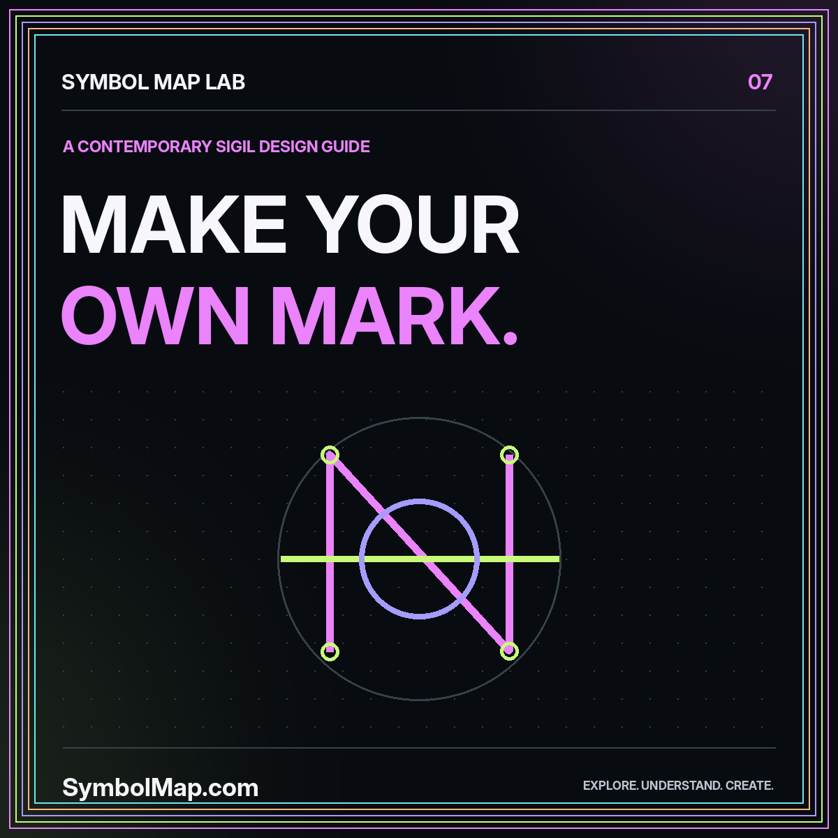
A personal sigil can be approached as a contemporary design exercise: a compact mark that represents an intention, a creative project, or a private reminder. You do not need to claim that the mark has supernatural effects or an ancient origin to make the exercise worthwhile. The design can be meaningful because you explain and use it deliberately.
This guide develops an original geometric emblem from a written brief. It is not a reconstruction of a historical ritual and does not prescribe a spiritual practice. Keeping that scope clear gives you more creative freedom while avoiding claims that the drawing process cannot support.
Write a brief you can actually draw from
Choose one purpose for the mark. A fictional example might be “return to focused work after a pause.” That sentence suggests a relationship between an interruption and a continuing line. It is more useful than asking the drawing to represent success, confidence, protection, creativity, and everything else at once.
Decide where you will use it. A small notebook stamp has different requirements from a large print. A mark for a narrow book spine needs a different composition from one intended to sit inside a circular badge. Write those constraints before sketching so you can evaluate the result against a real use.
Keep the brief private when its meaning is personal. The public-facing label can simply identify the design and its creator. A complete technical record does not require publishing the intimate story behind an emblem.
Separate this exercise from historical attribution
The word sigil appears in documented collections as well as contemporary creative practice. For example, the London Museum record for “Sigil, Glig Writere” identifies a particular design by John Hargrave, dated 1928–1930. That is evidence about one recorded work, not a licence to describe every newly invented mark as part of the same tradition.
For your own design, use an honest label such as “original personal emblem” or “contemporary sigil study.” Do not add a fabricated date, language, or lineage to make it feel more significant. The concept and construction process can stand on their own.
If you are researching an actual historical example, switch methods. Follow a source-based workflow rather than treating a creative exercise as evidence. The magic and occult context guide explains how to preserve that distinction.
Choose a small visual vocabulary
Select a few components: a line, a circle, a corner, a gap, or an intersection. Limiting the vocabulary makes the design easier to refine. The point is not that those shapes have universal meanings. You are assigning them roles inside this particular project and should describe those roles as design choices.
For the focused-work example, an interrupted outer line might surround a shorter continuous line. Another direction could use two offset segments joined by a single bridge. Both are possible interpretations of the brief. Neither is inherently more authentic or powerful.
Avoid adding familiar sacred or culturally distinctive motifs simply because they look mysterious. Starting from basic construction lets you develop an original visual relationship without relying on associations you have not researched. When a draft strongly resembles an existing emblem, pause and examine that resemblance before continuing.
Sketch families instead of isolated variations
Create several related versions of each direction. In one family, vary the size of a gap. In another, vary how two lines meet. Keeping one change at a time makes the effect easier to see. A sheet of unrelated drawings may be exciting but offers less information about what actually improves the mark.
Use a consistent drawing box and a single stroke weight for the first round. Save color, texture, and glow effects for later. A plain sketch exposes awkward junctions and accidental asymmetry that a polished presentation can conceal.
Label each version with an identifier and a short note. “B3: wider opening, fewer crossings” is a useful record. “Best one” is less useful after the order of the drawings changes. The symbol-map foundations guide uses the same principle for larger collections.
Reduce the mark without losing its structure
Choose a promising direction and remove one component. Does the design still express the relationship you intended? If so, the component may be unnecessary. Repeat the exercise until further reduction changes the basic idea or makes the form harder to distinguish.
Check intersections carefully. Several lines meeting in one place can create a heavy knot, while an almost-connection can look like a drawing error. Decide whether each join is open or closed and make that choice visible. Small, ambiguous gaps are difficult to reproduce consistently.
Test at the intended size
Print or display the mark where it will actually be used. A design that looks elegant across a whole page may collapse on a small label. Keep a simplified variant when necessary and record how it differs. A deliberate small-size version is better than letting each future user improvise one.
Give the design a name and a record
Write a short description of the final geometry. Include the orientation, number of major components, and intended use. A person should be able to distinguish the chosen version from earlier sketches without relying solely on the filename.
Keep the creative interpretation separate from the construction notes. “The bridge represents returning to a task” is your assigned meaning. “Two open arcs joined by a short horizontal stroke” describes the drawing. Both are useful, but they answer different questions.
Record the actual creation date and the source file. Do not borrow a historical date because the design was inspired by an older aesthetic. An original contemporary mark becomes easier to understand when its own history is documented accurately from the beginning.
Build a simple visual system around it
A single mark becomes more usable when it has clear presentation rules. Decide how much space surrounds it, which backgrounds it can sit on, and whether it has a reversed version. Choose rules that someone else can follow without seeing your original sketchbook.
Keep ornamental treatments separate from the master drawing. A neon glow may work for a digital poster, while a notebook stamp needs solid edges. Export each treatment from the same approved structure instead of redrawing the symbol every time. That reduces accidental drift.
The sigil symbol map provides a brief-to-form checklist, while the logo symbol map extends the same comparison process to public-facing identities. A personal emblem and a commercial identity may share design techniques without sharing the same use requirements.
Use feedback without surrendering the brief
Show the mark without explaining your intended meaning first. Ask what viewers notice about the structure and whether any part appears unclear or accidentally resembles something else. This gives you information about the drawing rather than rewarding agreement with your story.
Then explain the brief and ask whether the design relationship is legible. You are not testing supernatural effectiveness. You are checking whether a visual choice supports a stated idea. The distinction keeps the conversation specific and makes useful revision possible.
Not every viewer needs to discover the private meaning unaided. A personal emblem can remain personal. What matters is that you do not confuse your assigned interpretation with a universal definition or make claims about other people's beliefs based on their response.
Keep the exercise grounded
Treat the mark as an artwork or reminder, not a guarantee of external outcomes. A drawing can accompany a plan, a notebook habit, or a creative project; this guide does not establish that it changes events beyond those ordinary uses. Keep any spiritual interpretation attributed to the person holding it.
Save the rejected sketches as well as the final version. They show which decisions simplified the design and can help you build a related family later. A readable process record is often more valuable than a collection of polished exports with no explanation.
Conclusion: make a mark with an honest story
A thoughtful personal sigil starts with a clear brief and ends with a reproducible drawing. Limit the visual vocabulary, compare related versions, and document the meaning you assigned without inventing a historical authority for it.
The result can be distinctive and personally useful on its own terms. It does not need claims of guaranteed effects, borrowed cultural significance, or a mysterious origin to justify the care you put into designing it.
Explore this thread


